

© It’s Your Education, Your Europe!
© 2023 / Design by: THE CRITICAL
Brand Files
Colors, Grid, Graphic Elements,
Motion, Illustrations and Icons,
Abstract Materials
MS Teams
This is an official gallery containing
visual photos and videos by ATHENA.
composing text and
other information
To ensure that ATHENA’s brand represents its positioning and
maintains brand integrity across various applications, follow these
fundamental rules for composing information.
If there is a large amount of information, it should be organised into
multiple sections and displayed in a hierarchical structure.
↓
The hierarchy of information
1. Main headline + subheadline if needed.
2. Subheadline or other secondary information.
3. Body texts or two key points on one composition.
4. Body texts + photo or illustrations.
4. Outro (logos or other short message).
↓ Other Rules
1.
Avoid using only bullet points. Instead,
try to compose short yet creative
texts. If bullet points must be used,
consider using numbered lists for
other vital points.
1. 2. 3.
2.
It is crucial to allocate a designated
composition space for each piece of
information. Following composition
hierarchy and recommendations can
improve content quality and
effectiveness. Prioritise clarity and
organisation in composition.
3.
All rules are essential. Don’t forget to
follow guidelines for headline and
brand name styling, formatting
headlines to uppercase, and adhering
to graphic element and logo usage
rules to maintain brand coherence.

and other related words.
abstract / 3Dabstract / texture / closeup / macro /
science / technology / tech / laboratory / sustainability
All official materials are highly recommended to be made for various usages. On the other hand,
abstract materials can be found in various free photo and video stocks. These keywords are here
to help ease the search:
3. Documentary
2. Abstract
1. Official
There are three themes in
photography and video content:
Photography and video are versatile
visual media that serve various
purposes in different fields. Their
significance lies in their capacity to
communicate technology, science,
and artistic expression.
Visual Materials
Official & Abstract
This content showcases events, daily life, people, abstract visuals, and materials related to
ATHENA. Abstract photos are used for scientific topics, and professional images are for general
and formal topics. All materials are bright, high-quality, and have natural lighting with a sharp focus.


A bright style, high-quality natural lighting, and sharp focus
distinguish the official materials. Abstract materials visualise lights
and 3D objects, creating scientific and technological content.
Download Official Materials
Documentary
The ATHENA brand makes these materials. To maintain consistency with the official visual
materials created over time, the photos used in documentary materials should reflect the same
style. Kindly refer to the MS Teams cloud drive via the link below to access and download these
materials.
Links to galleries:
Icons
For a more professional look, it is recommended to use bold blue icons on a white background.
To avoid confusion, it is best not to combine icons and illustrations. Keep in mind that icons should
only be used in presentations. There are a total of 480 different icons that are available.
Download Icons

The main icon set can be found in the "Icons" folder within the brand package. If a different theme
of icons is needed, it can be downloaded with an Adobe Creative Cloud license from this link.
Illustrations
Illustration is an excellent visual tool for communicating complex messages, metaphors, or
concepts. Flat, monoline and minimalistic stylisation are the main keywords defining the
recommended illustration style for ATHENA’s visual identity. There are a total of 170 different
illustrations. Download Illustrations


The Usage
The illustration can be used on the
primary and secondary colours of the
brand.
Regardless of the background colour,
the image remains black with a 50–
70% opacity.
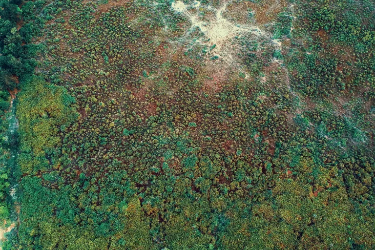
Graphic Element
The Star
The brand’s graphic element is a star that resembles the ATHENA logo symbol. It is the most
distinguishable element of the visual identity. The dynamic impression and creative outlook of the
star are enhanced with multiple colour combinations, compositional features, and motion.
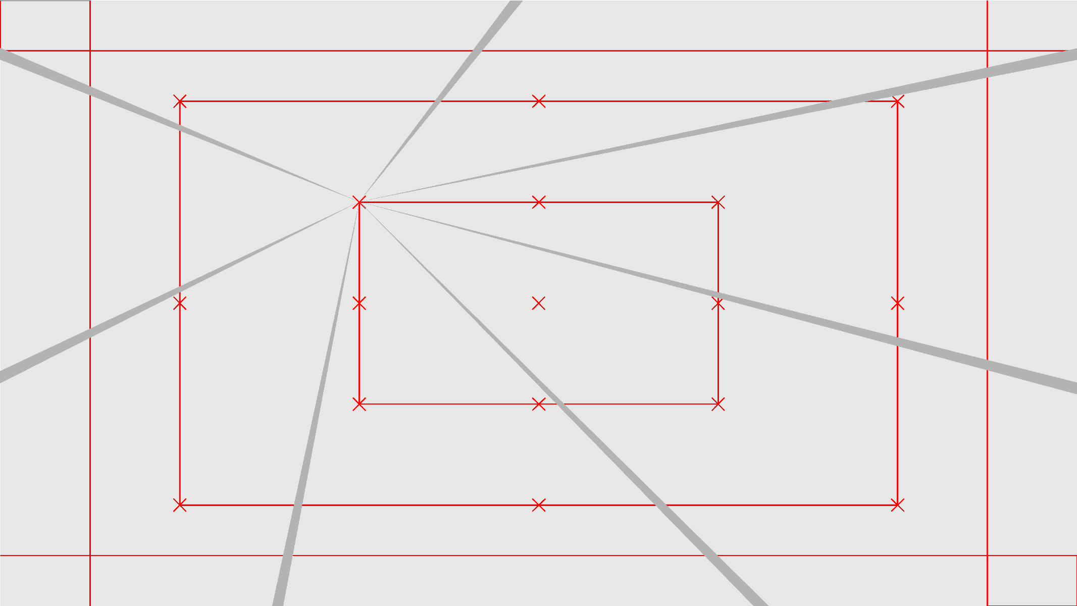
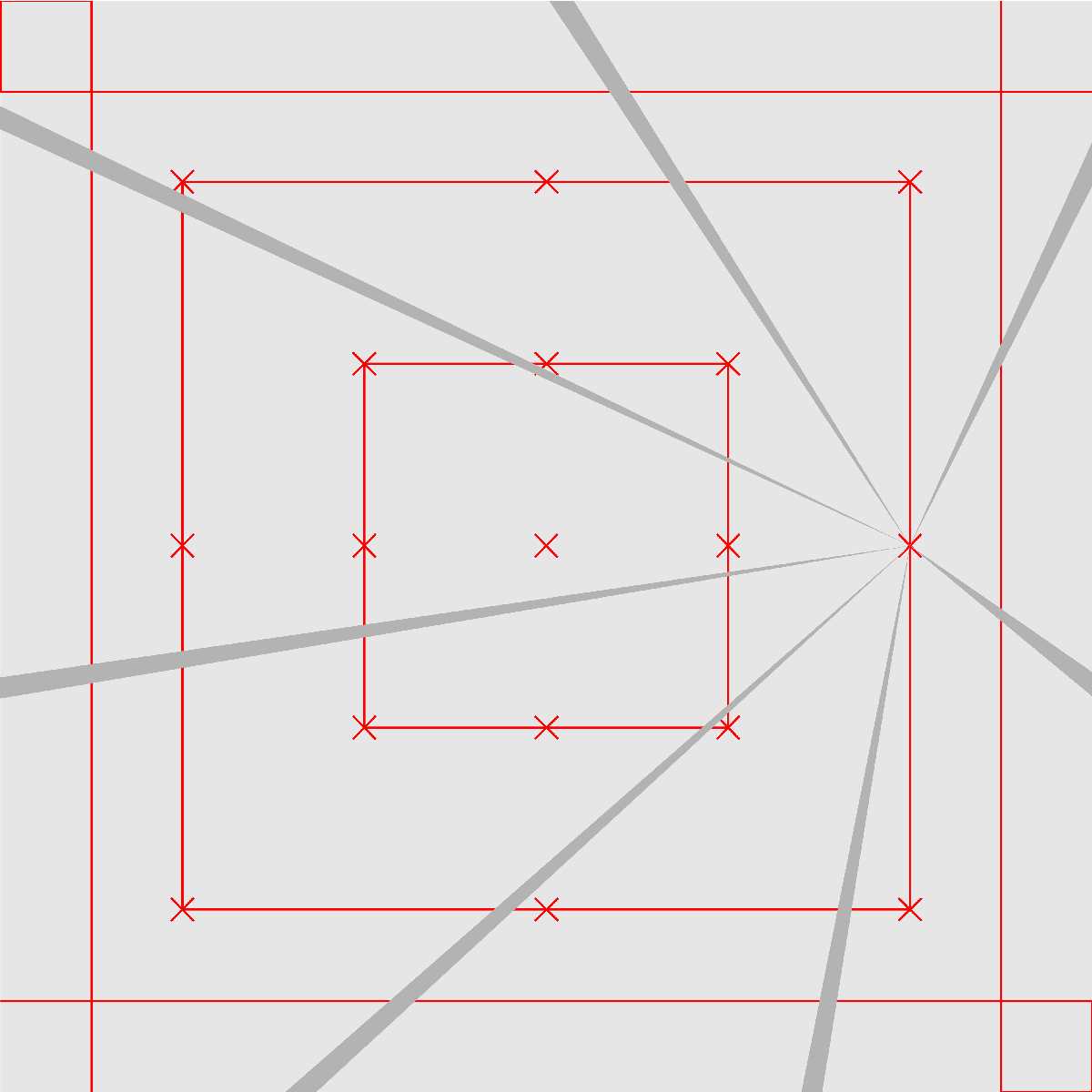
The design space utilises a layout grid with red x markers indicating the centre of the graphic
element at three different levels.
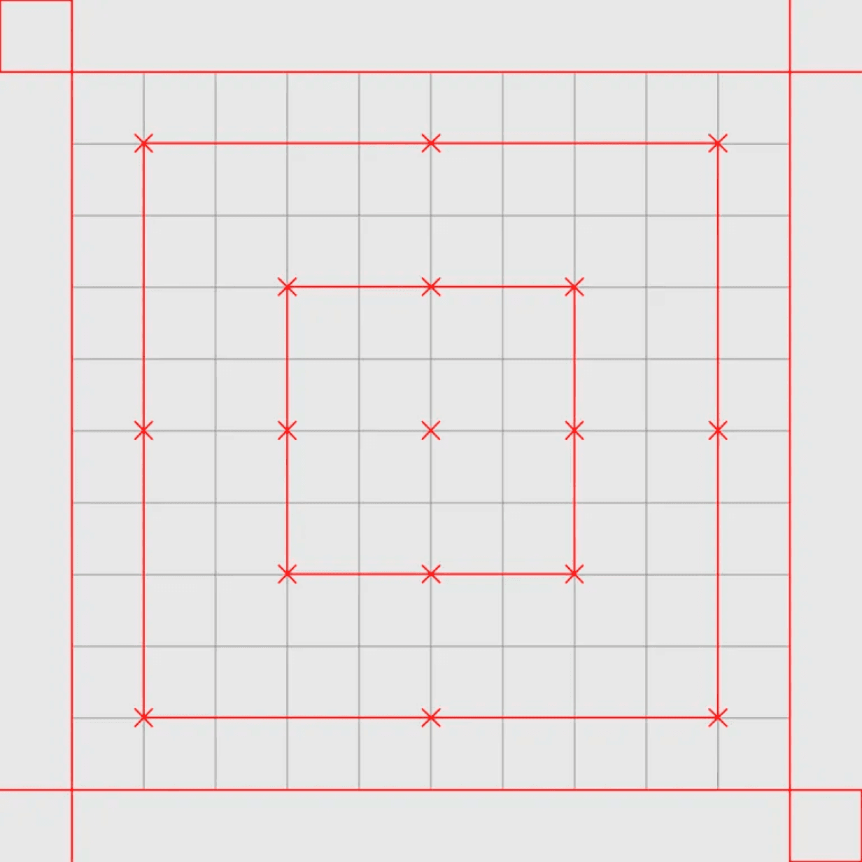
Square grid
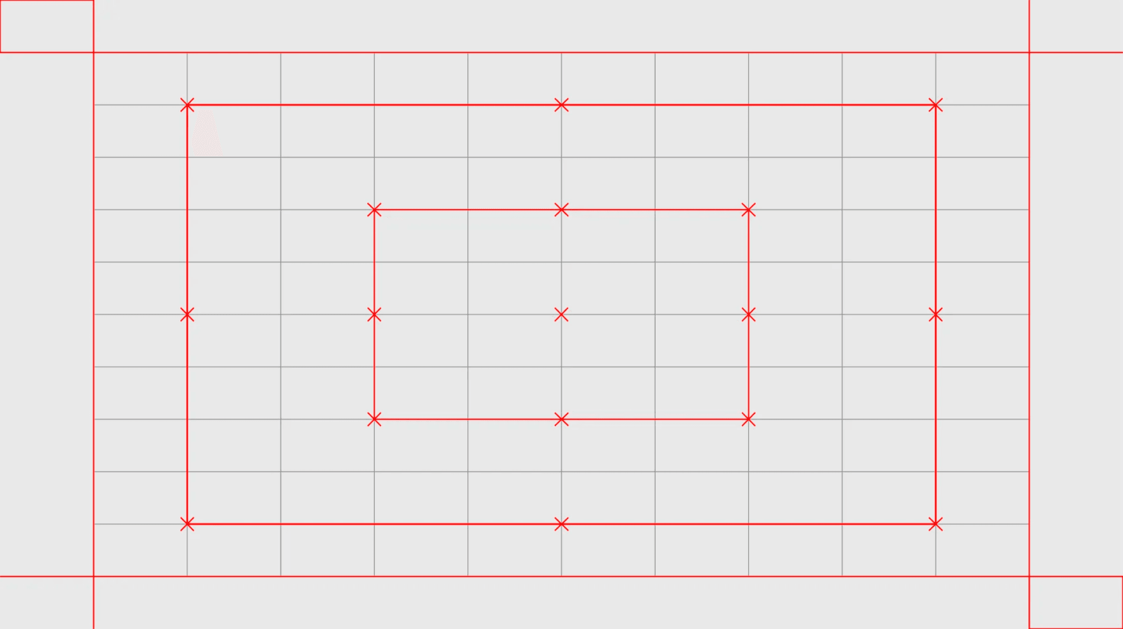
Rectangular grid (for vertical and horizontal formats)

x marks the center of the star
Principles of
the Element
A grid and red x markers create consistent imagery throughout various applications. The star is
used in compositions based on two principles:
1. Framing the element.
2. Repositioning the star’s centre.
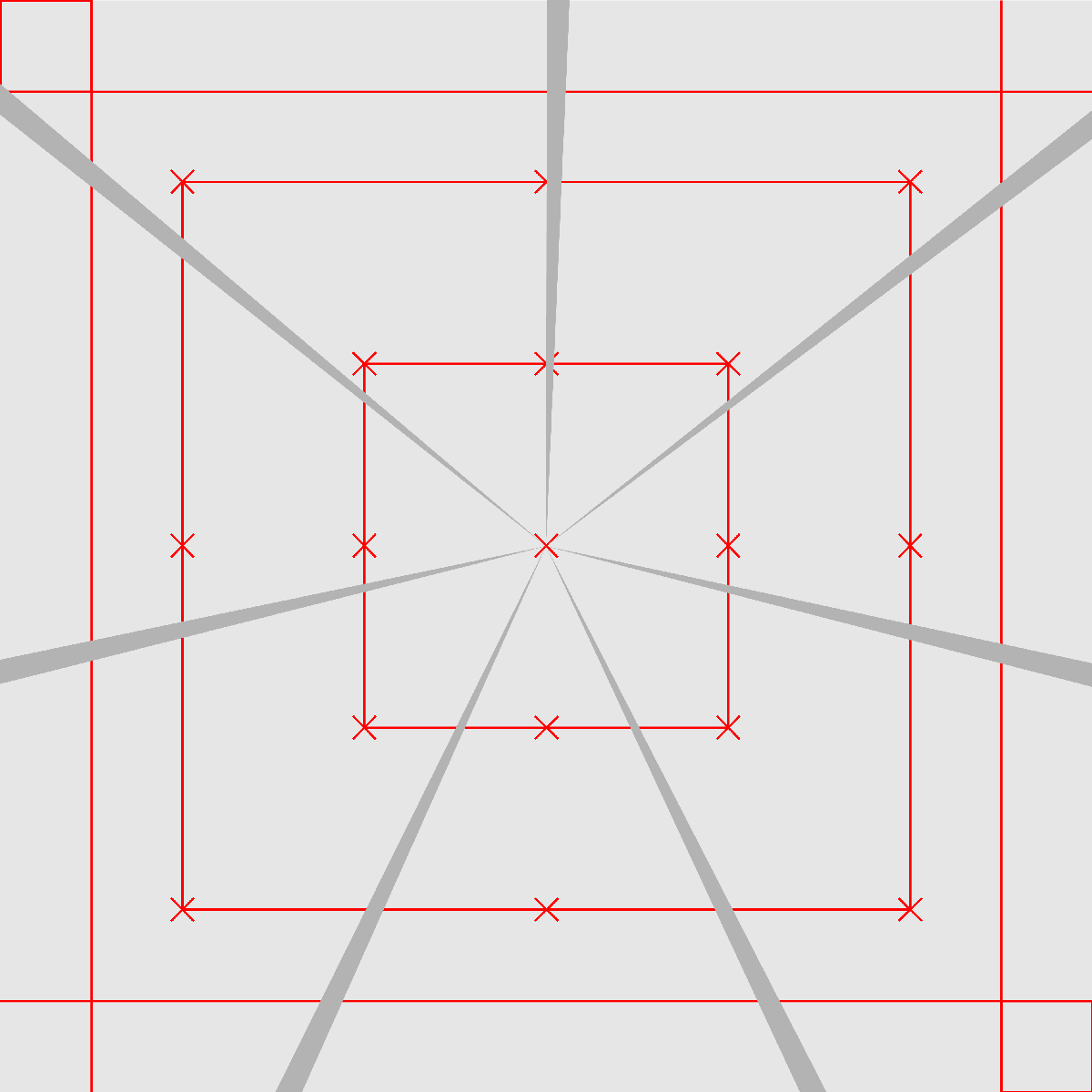
1. Framing the element

2. Centre’s repositioning
Important (!)
When the star element is framed, its proportions don’t adapt to format proportions: the element
changes only its size, and when the element is used with a different location of its centre, it adapts
to format proportion.
ATHENA’s graphic element has two
motion principles that make the brand
look more modern and tech.
The element’s motion is based on two
principles: slow rotation and the
element’s centre repositioning.
1. Framing the element
When scaling the size of the star on the grid x marker, it is important to frame it so that all line ends
remain outside. This ensures a proper and accurate representation of the star’s dimensions.
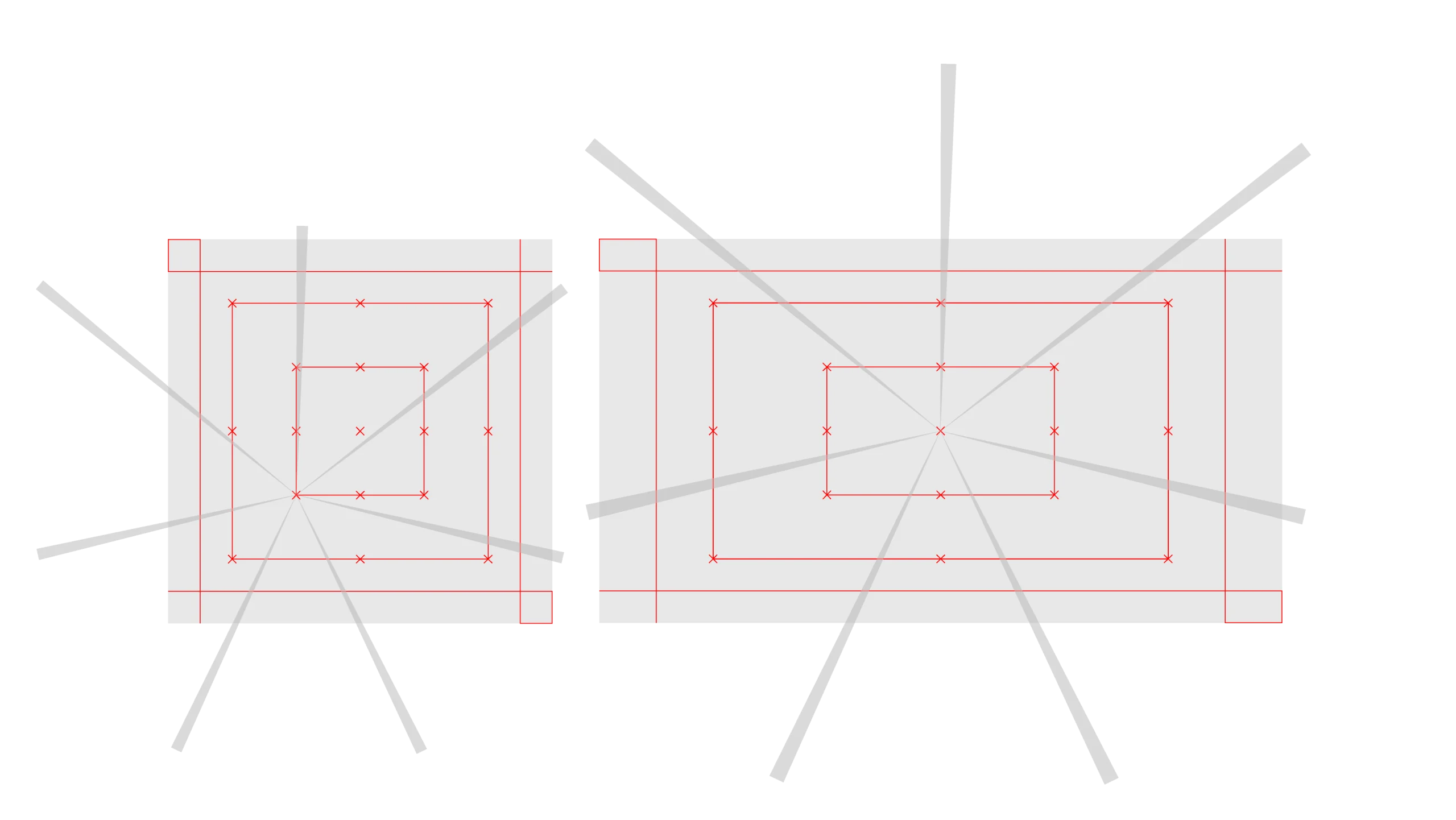
2. Centre’s repositioning
Adjusting the centre point of the element to align with one of the grid x markers facilitates effective
composition and ensures that all line ends remain outside. This approach enables the star to adapt
to the composition format while maintaining its integrity.

Centre →
The centre position of the element can be designated using the x marker on the grid in both star
composition principles!

Scaling Rule
As the element increases in size, the
thickness of its lines proportionally
increases as well.
This rule also applies to the usage of
the star in larger applications.
Opacity Rule
The graphic element is always
displayed at 50% colour opacity on
both primary and secondary colour
backgrounds.
In official forms, diplomas, and
exceptional cases, the percentage
can be reduced to 20%. Please
ensure adequate visibility with enough
contrast.

Graphic element:
50% opacity
–
Background colour:
100% opacity
–
Logo & text:
100% opacity
Colour-Logic &
The Star Element
Colour-logic displays almost all possible one-colour tone harmonies, graphic element opacity rule,
and the compositional principle usage between secondary and primary colour palettes.


Colour Rules ↓
1. Primary colour backgrounds with a
secondary colour star element in 50%
opacity.
2. Secondary colour backgrounds with
a primary colour star element in 50%
opacity.
3. White backgrounds with a
secondary colour star element in 50%
opacity.
Important (!)
These layout principles apply to all formats, not just limited to the square format.
Grid & Layout
The grid is a design tool that maintains visual integrity across different formats. Two grids are used:
rectangular (vertical & horizontal) and square. The vertical and horizontal grids can be adapted to
other sizes by stretching them as needed.
The grid consists of 12 x 12 squares, with the first and last squares as margins and the remaining
10 creating space for elements. The grid’s red lines indicate margins and recommended locations
for aligning elements. Download the Grid
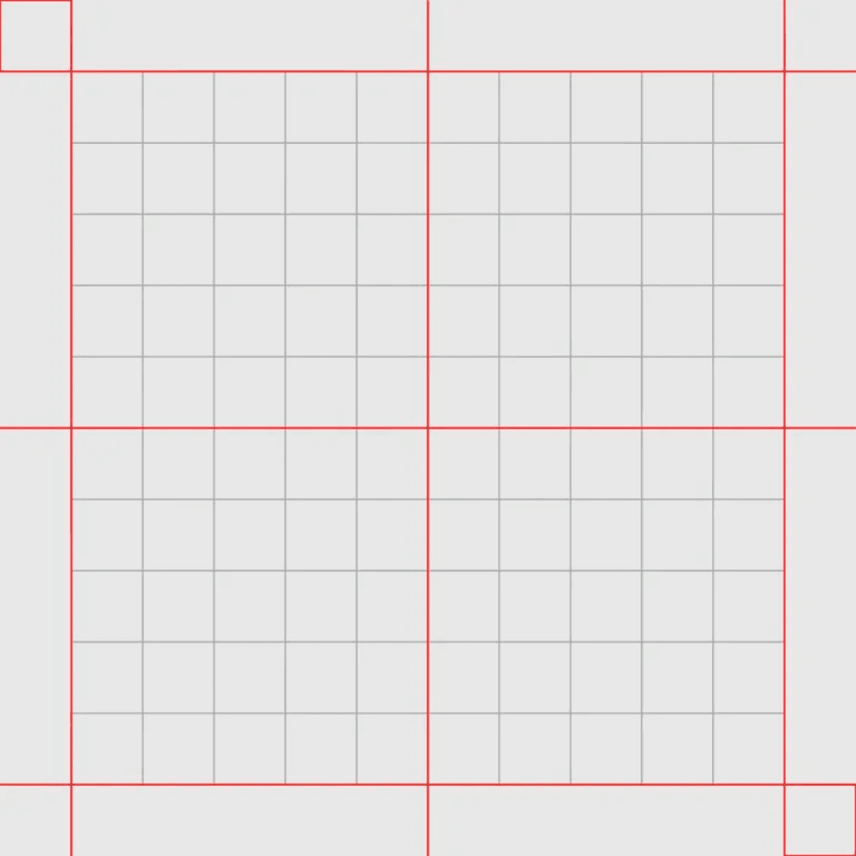
12 x 12
Square grid

12 x 12
Rectangular grid (for vertical and horizontal formats)
In the grid, layouts follow two compositional principles for elements: left alignment & center
alignment and, in exceptional cases, right alignment for a shorter copy. When there is more textual
information, it is recommended to use left alignment.
Layout
Examples
These examples demonstrate the main rules for composing graphic elements. If a graphic element
is used, it must appear only in the background. If a photo and graphic element are used, the
graphic element must always be on top of the image.
Here, text layouts are not included because of their simplicity, only more complex layouts are
displayed.

One small photo layout

Double photo layout
1. Part-composition layouts where
photos or illustrations are placed
within the margins.

Horizontal half-photo layout

Vertical half-photo layout
2. Half-composition layouts where
photos or illustrations are placed
beyond the margins.
3. Full image layouts where photo or
illustration fills all composition space
and elements are on top.
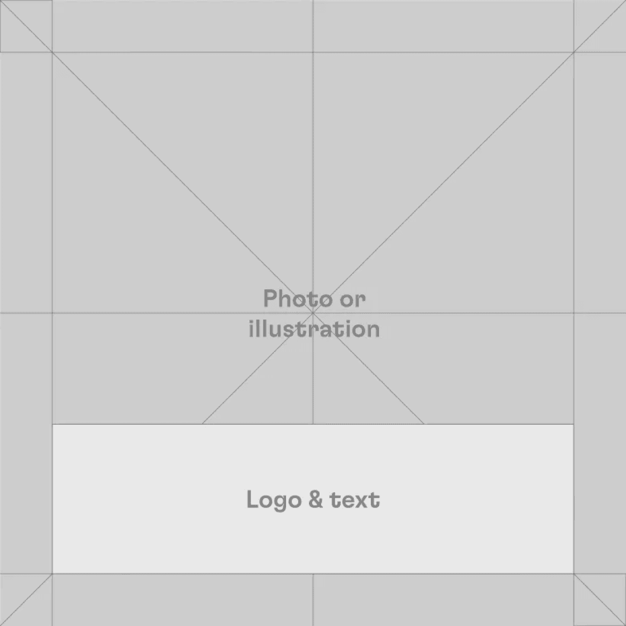
Full frame image with the safe zone
for smaller text and other elements.
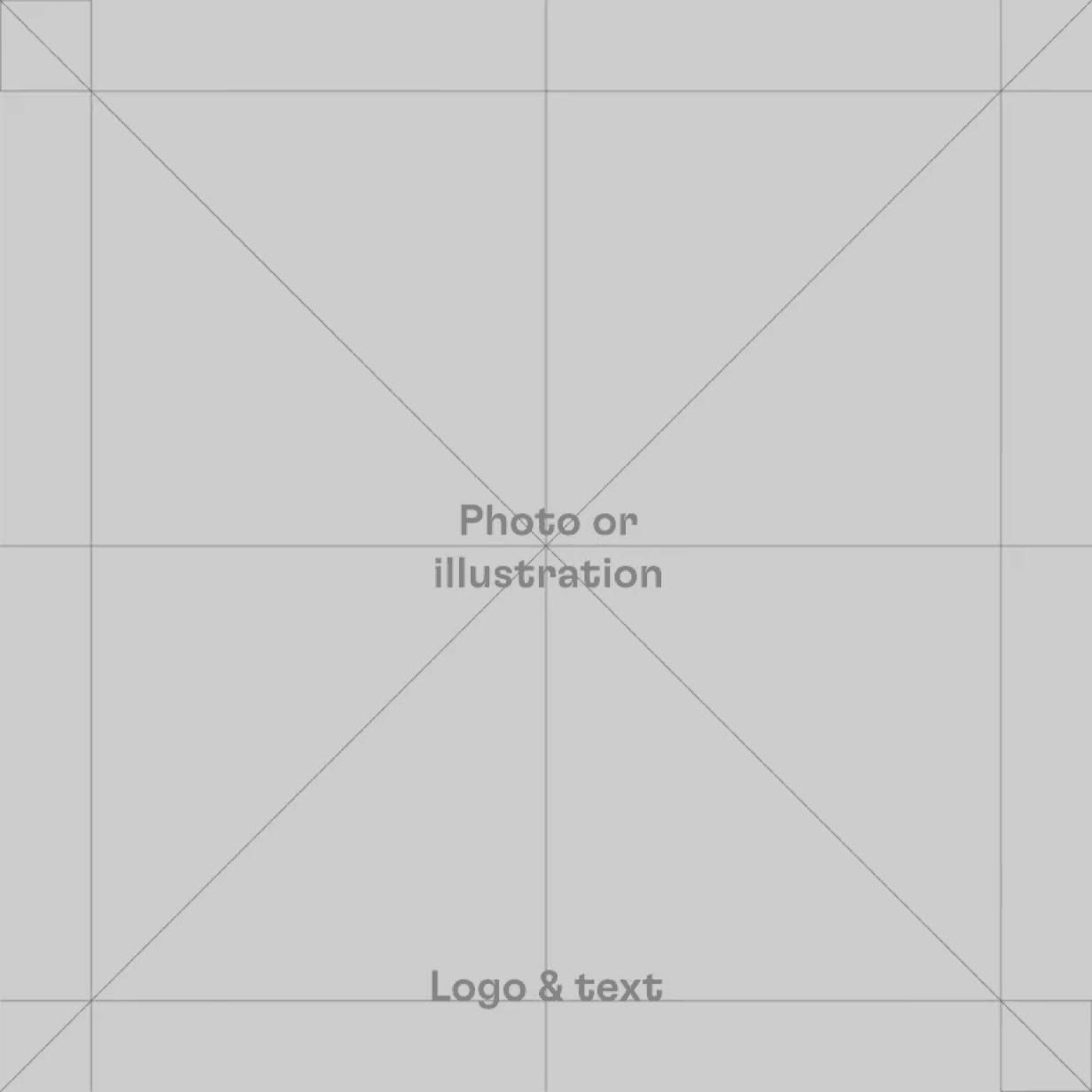
Full frame image with bigger text and
logos on top of the picture.
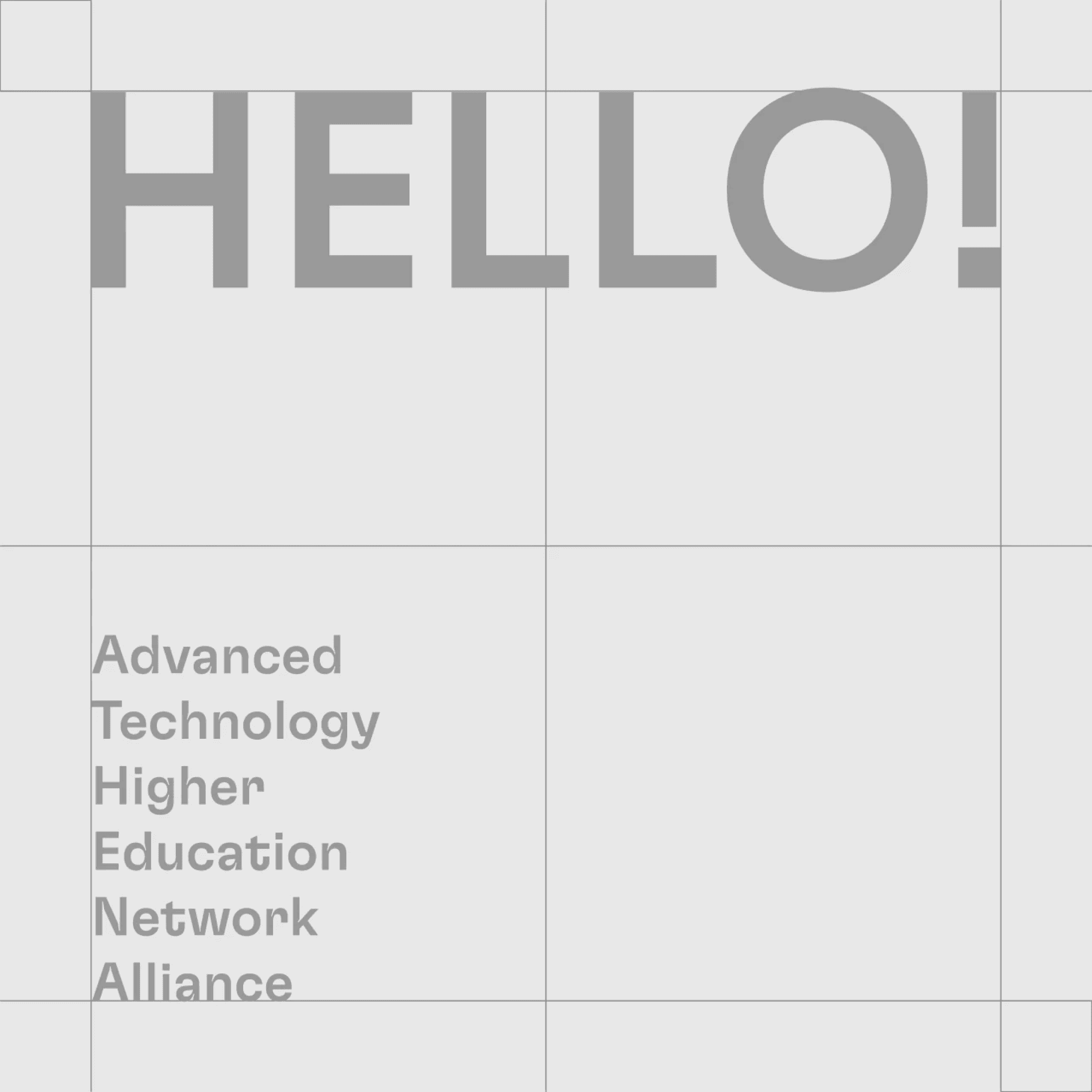
Typography
Primary Typeface
The primary brand typefaces are GT Flexa Standard and Arial. Headlines use Regular and
Medium styles of GT Flexa in uppercase formatting, and subheadlines use GT Flexa without text
formatting. Arial is used for body text and secondary information.
1. Headlines or Titles
–
GT Flexa Standard
Medium / Regular
Uppercase
An example of a typographic hierarchy, including font sizes and styles, within a layout. If headlines,
subheadlines, or body text contains the brand name ATHENA, it must be written in uppercase style
word formatting.
It’s Your Education!
It’s Your Future!
ATHENA
Join the Alliance!
ATHENA aims to deliver inclusive, innovative, high-quality international education permanently
aligned with global market needs.
2. Subheadlines
–
GT Flexa Standard
Medium / Regular
3. Body Text
–
Arial
Regular
A headline and subheadline font style
depends on the size of the headline in
the application.
⓪①②③④⑤⑥⑦⑧⑨
← ↓ ↑ → 🔃 ⟳ × •
Recommended glyphs are displayed here. Select, copy, paste!
Glyphs
The GT Flexa font contains useful
symbols-glyphs, which can be used in
various text-based software
supporting the installed typeface.
Medium or Regular?
1. Medium
GT Flexa Medium is commonly used for headlines and subheadlines
in most applications. The GT Flexa’s regular size is used in larger
format applications.
2. Regular

GT Flexa switches from medium to regular in larger formats or short
headlines but rarely in subheadlines.
Important (!)
Avoid using a logo that includes a wordmark when using the brand name in a headline. Always
capitalise the brand name and keep headlines short, simple, and free of complex words.
ATHENA’s brand headlines feature
dynamic motion graphics that create a
connection with the brand’s Sage
archetype through elegant yet modern
animations.
Motion is based on fade-on for shorter
headlines and fade-up options for
longer headline copy.
Text & Colour
When using brand colour backgrounds, use white text on primary colours and primary colour text
on secondary colours. On white backgrounds, use primary colour text. Remember to keep colour
harmony and logic in one application.
On the primary colour background
On the secondary colour background
On a white background
TEXT ON COLOUR
TEXT ON COLOUR
TEXT ON COLOUR
TEXT ON COLOUR
TEXT ON COLOUR
TEXT ON COLOUR
TEXT ON COLOUR
TEXT ON COLOUR
TEXT ON COLOUR
TEXT ON COLOUR
TEXT ON COLOUR
TEXT ON COLOUR
TEXT ON COLOUR
TEXT ON COLOUR
TEXT ON COLOUR
Colour-Logic
& Text
Here’s an example of text on a
coloured background that follows the
colour-logic harmony rule in a
composition.
Text sizes only show headline,
subheadline, and body text hierarchy
on one colour space.

Colours
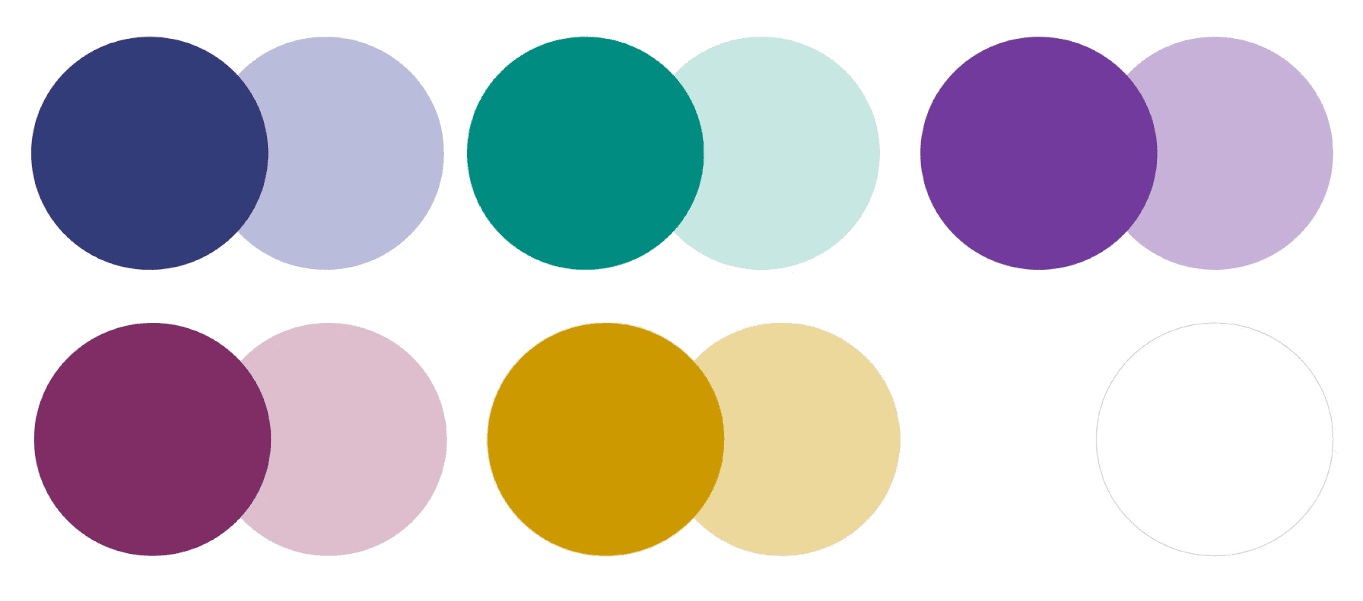
Primary
Colours
Primary colours are the key colours that establish brand identity. They are used in both printed and
digital materials. Dark blue is the dominant brand colour, conveying ATHENA’s reliability; it should
be primarily used for official applications such as stand-alone logos, documents, and letterheads.
In adherence to the brand visual identity guidelines, primary colours can be used as accents
combined with secondary colours.
Bold Blue
HEX
#313C79
RGB
49, 60, 121
CMYK
93, 79, 6, 21
Pantone ®
3590 C / 3590 U
Bold Plum
HEX
#802D64
RGB
128, 45, 100
CMYK
27, 89, 10, 29
Pantone ®
7648 C / 7648 U
RGB
0, 140, 129
CMYK
99, 2, 53, 10
Pantone ®
326 C / 326 U
HEX
#008C81
Bold Green
Bold Yellow
HEX
#CD9A00
RGB
205, 154, 0
CMYK
2, 37, 100, 11
Pantone ®
7408 C / 7405 U
HEX
#723A9D
RGB
114, 58, 157
CMYK
65, 88, 0, 0
Pantone ®
7442 C 7442 U
Bold Violet
White
HEX
#FFFFFF
RGB
255, 255, 255
CMYK
0, 0, 0, 0
Pantone ®
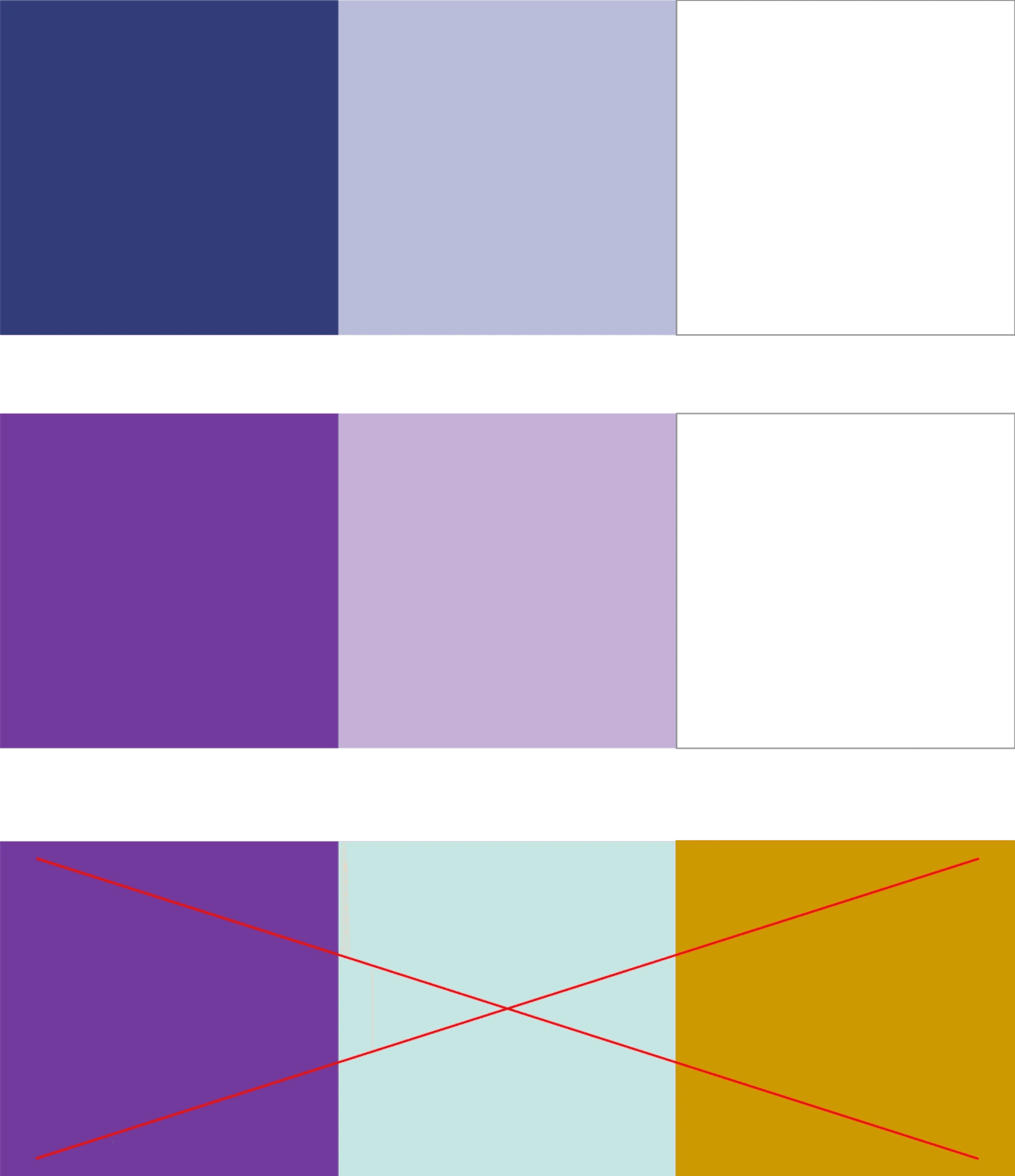
Secondary Colours
Secondary colours add vibrancy and softness to ATHENA’s visual identity, creating a dynamic and
modern look. They also help convey brand archetypes of Creator and Caregiver. Use these
colours when following visual identity guidelines, such as in external social media communications
and advertising campaigns.
Light Blue
HEX
#B9BDD9
RGB
185, 189, 217
CMYK
31, 23, 4, 0
Pantone ®
2706 C / 2706 U
Light Plum
HEX
#DDBECF
RGB
221, 190, 207
CMYK
8, 32, 7, 0
Pantone ®
670 C / 670 U
RGB
198, 230, 228
CMYK
30, 0, 15, 0
Pantone ®
7464 C / 7464 U
HEX
#C6E6E4
Light Green
Light Yellow
HEX
#EBD799
RGB
235, 215, 153
CMYK
6, 14, 48, 0
Pantone ®
7401 C / 7401 U
HEX
#C7B0D8
RGB
199, 176, 216
CMYK
22, 35, 0, 0
Pantone ®
7437 C / 7437 U
Light Violet
*
Primary and secondary colours are
always used according to the brand
colour-logic.
Colour
Profiles
These are recommended colour profiles across many applications: Adobe RGB 1998 for digital
space and ISO Coated v2 (ECI) for printable applications. Please use them whenever possible.
Colour appearance may vary in different profiles.
Other Colour Profiles (!)
To ensure a uniform brand representation, you must modify colours to coincide with the ones
indicated in the identity guide, as colour appearance could vary in different colour profiles.
Colour-Logic
Only similar primary and secondary colour tones can be used in one
application. Different colours can never be mixed in one
compositional space; all element colours should be in the same
colour tone.
For example, if the leaflet cover design is blue, the inside text colour,
background, or graphic element colour also should be blue.
About
ATHENA’s branding guidelines include colours, typefaces, graphic elements, motion, and rules for
applying each element. For new applications, it is important to follow these guidelines to maintain
brand consistency and reflect positioning values.
Motion
ATHENA’s brand identity incorporates dynamic graphic elements, including a star element and
main headlines. The star element is based on two simple principles: rotation and its centre
following a path on the grid locations marked with x. Headlines appear in various applications
following one principle and two effects: fade-on for shorter headlines and fade-up for longer
copies.
The Star Element
Motion Principles
1. Rotation on the x
–
This principle is used when the
element is framed in a composition.
2. Centre’s repositioning
–
This principle is used with the element
adapted to the composition format.
1. Rotation
2. Repositioning on the x
Headline Motion
Motion Principles
1. Fade-on
–
For short headlines
2. Fade-up
–
For longer headlines
Headline motion files can be edited in
Adobe After Effects software.
Motion Examples
Motion files are created using primary and secondary colour palettes, incorporating both motion
principles and including motion without a background. All motion open files are made in Adobe
After Effects and can easily be applied to many applications.
Important (!)
A graphic element or headline motion should be used in one application to avoid unnecessary
visual noise.
Identity & TOols
| Identity & Tools
ATHENA Brand Guidelines